ShopDreamUp AI ArtDreamUp
Deviation Actions


Suggested Deviants


Suggested Collections


You Might Like…


Featured in Groups


Description
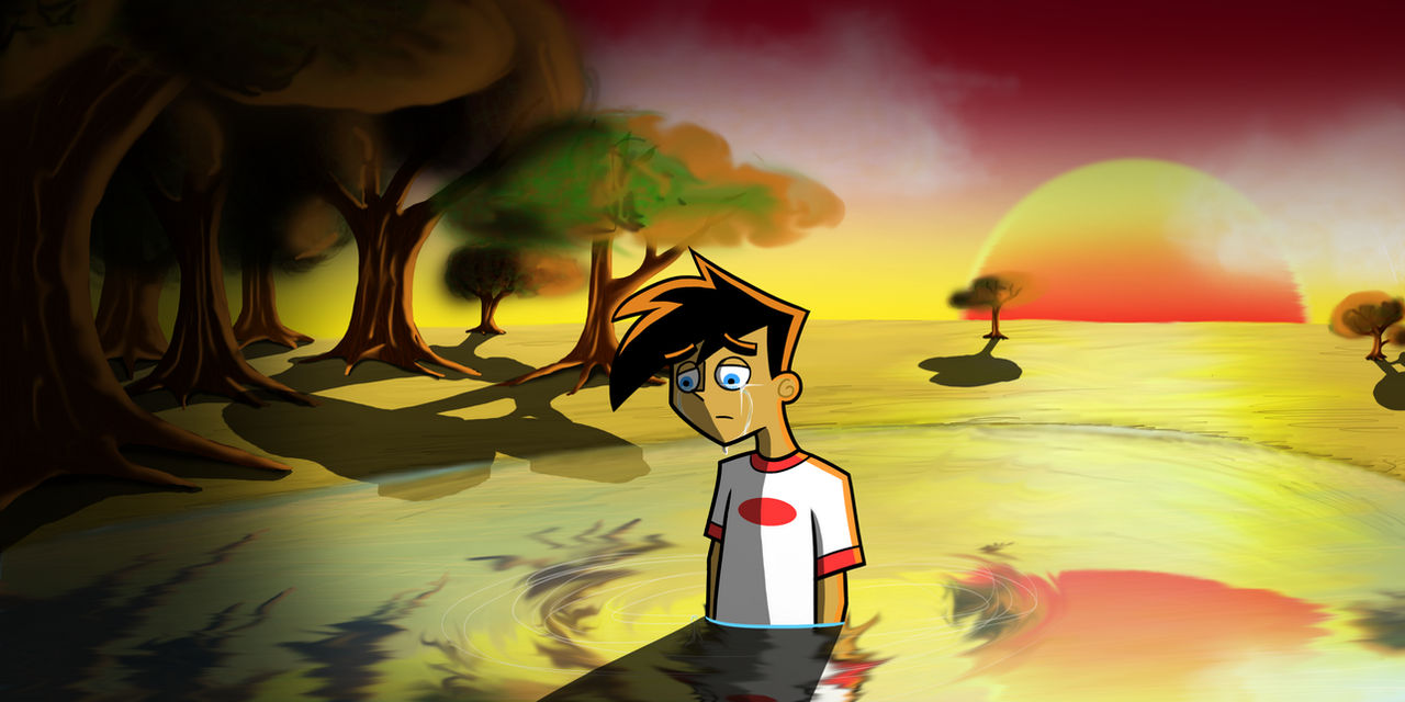
I'M IMPROVING!!!!! I'M FUCKING IMPROVING!!!!
THIS IS THE BEST THING MY HANDS EVER CREATED!!!! *_______*
(Although I'm not satisfied with the trees )
)
Sry I'm so proud of myself right now ;;A;;
Something angsty again...
THIS IS THE BEST THING MY HANDS EVER CREATED!!!! *_______*
(Although I'm not satisfied with the trees
Sry I'm so proud of myself right now ;;A;;
Something angsty again...
Image size
3000x1500px 3.84 MB
© 2012 - 2024 CwieChanti
Comments65
Join the community to add your comment. Already a deviant? Log In
Normally you would've scored higher in the originality department, but the style you used is, of course, based on the original art style. Which isn't bad, just not so original.
The texture on the grass and the ripples on the lake are very well done. And I love how you defined the bark on the trees. The color tonality really sets off the bittersweet mood.
The piece also lacks a certain amount of consistency. Danny doesn't really fit in with the picture. He doesn't have the same smooth, soft look, partly due to the fact that he's the only figure outlined in bold black. If you're going to outline something, then you have to outline the entire picture to obtain the same consistency.
The shadows are also rather inconsistent. While the rest of the background has a semi-blurry look, the boarders of the shadows are very well defined. Especially Danny's shadow. The shadow should bend in the lake. The ripples in the water alter the path a shadow takes.
And the shadow on Danny is misplaced. Following the angle of the sun, his entire face and front body should be shrouded. The shadow on the body is also inconsistent with the one on the lake.
I would suggest you use a different style when drawing intricate and moody pictures like this. The limitations of the art prevents the artist from weaving the character into a detailed piece. The style of the cartoon is too simple to add in textures and anatomy. For example, the tear doesn't follow what should be the cheeks, entirely. This may be because it is difficult to tell where the cheek-line really is due to the art style.
To sum up, great job on the textures and background. Your characters and shadows could use a little work.